UI/UX Case Study - native app design
Bean Map
Project Overview
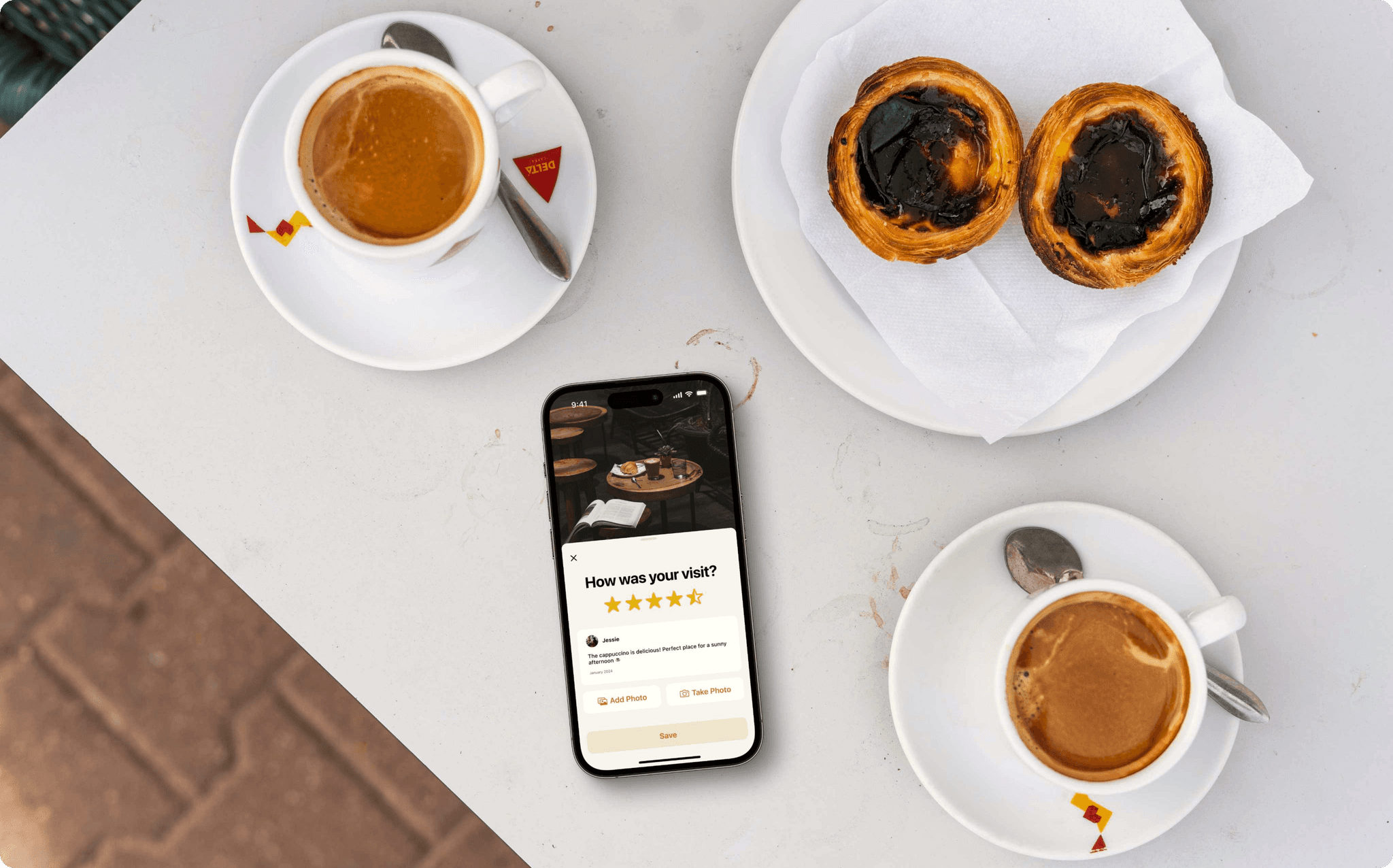
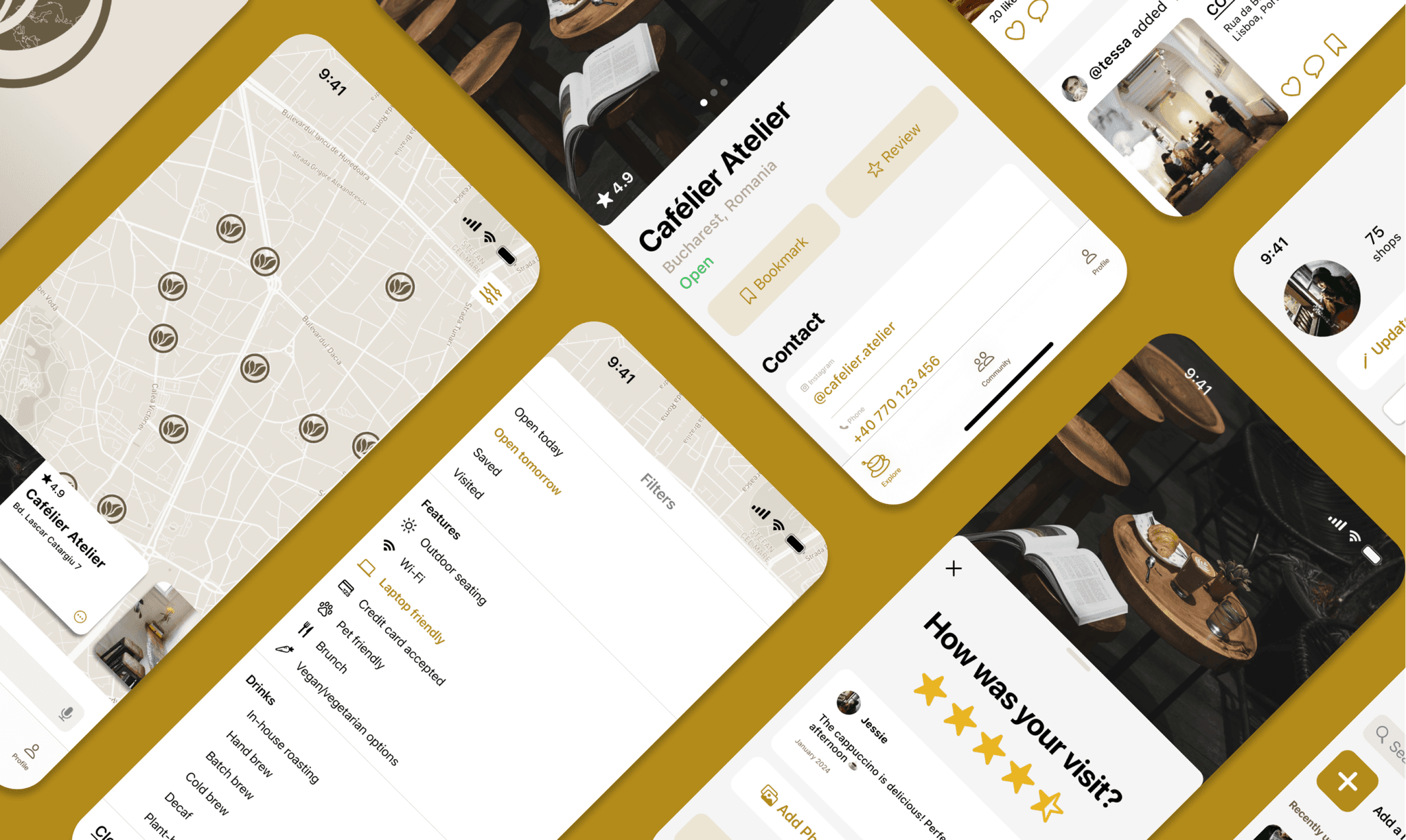
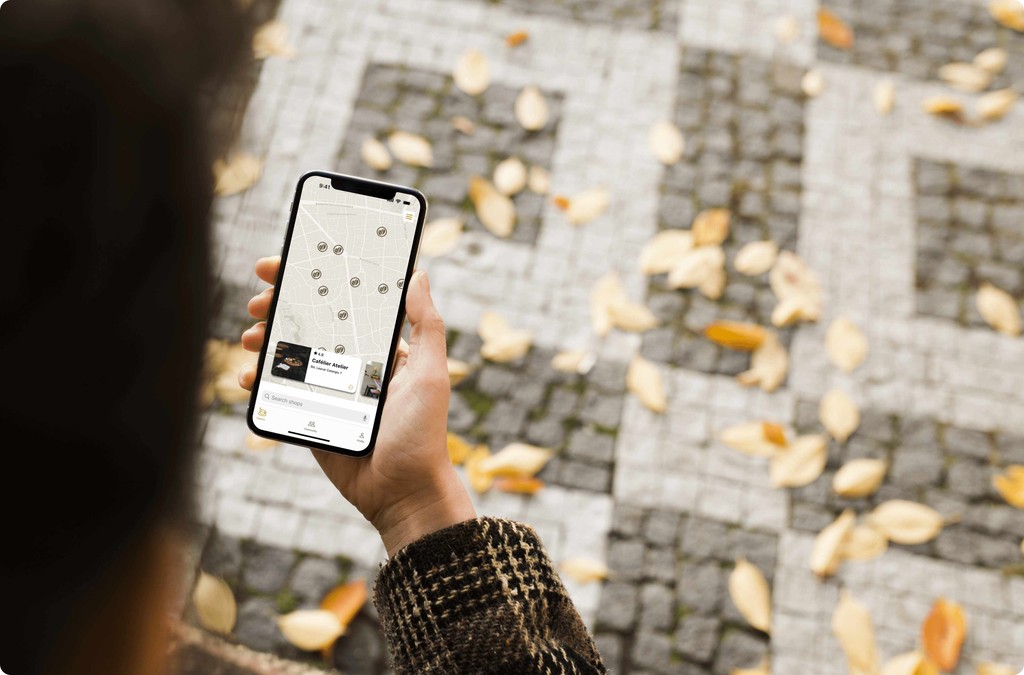
Bean Map is a mobile app designed for both iOS and Android platforms that leverages geolocation to provide a seamless experience for finding specialty coffee houses and connecting with a community of fellow coffee lovers.
Problem Statement
Many coffee enthusiasts struggle to find specialty coffee shops beyond the common chains, especially when exploring new cities. Traditional methods like Instagram searches and Google reviews can be time-consuming and lack a dedicated, engaging community for coffee lovers. Users seek a more efficient way to explore and share their coffee experiences.
Proposed Solution
Bean Map offers an intuitive platform that allows users to effortlessly locate and review specialty coffee shops, explore detailed shop profiles, and share their coffee experiences with friends. By integrating geolocation features and a user-friendly interface, Bean Map streamlines the process of discovering and sharing specialty coffee spots, making it simpler to enjoy and document the vibrant café culture.
Designing Bean Map's Path
There are five categories of users who will use the app:
Coffee enthusiasts who have a passion for exploring and tasting specialty coffee
Students and young professionals who enjoy studying or working in coffee-friendly environments
Social media influencers sharing their coffee experiences and looking for trendy spots
Digital nomads who seek cozy coffee shops to work from and appreciate quality coffee
Travelers looking for local coffee spots to experience the coffee culture of different regions
All these users can interchangeably utilize the app, with intuitive design elements ensuring a smooth and engaging experience.
Core areas to design
Map interface with search and filter options
User reviews and ratings
Social integration
Navigating the Landscape: Competitive Analysis
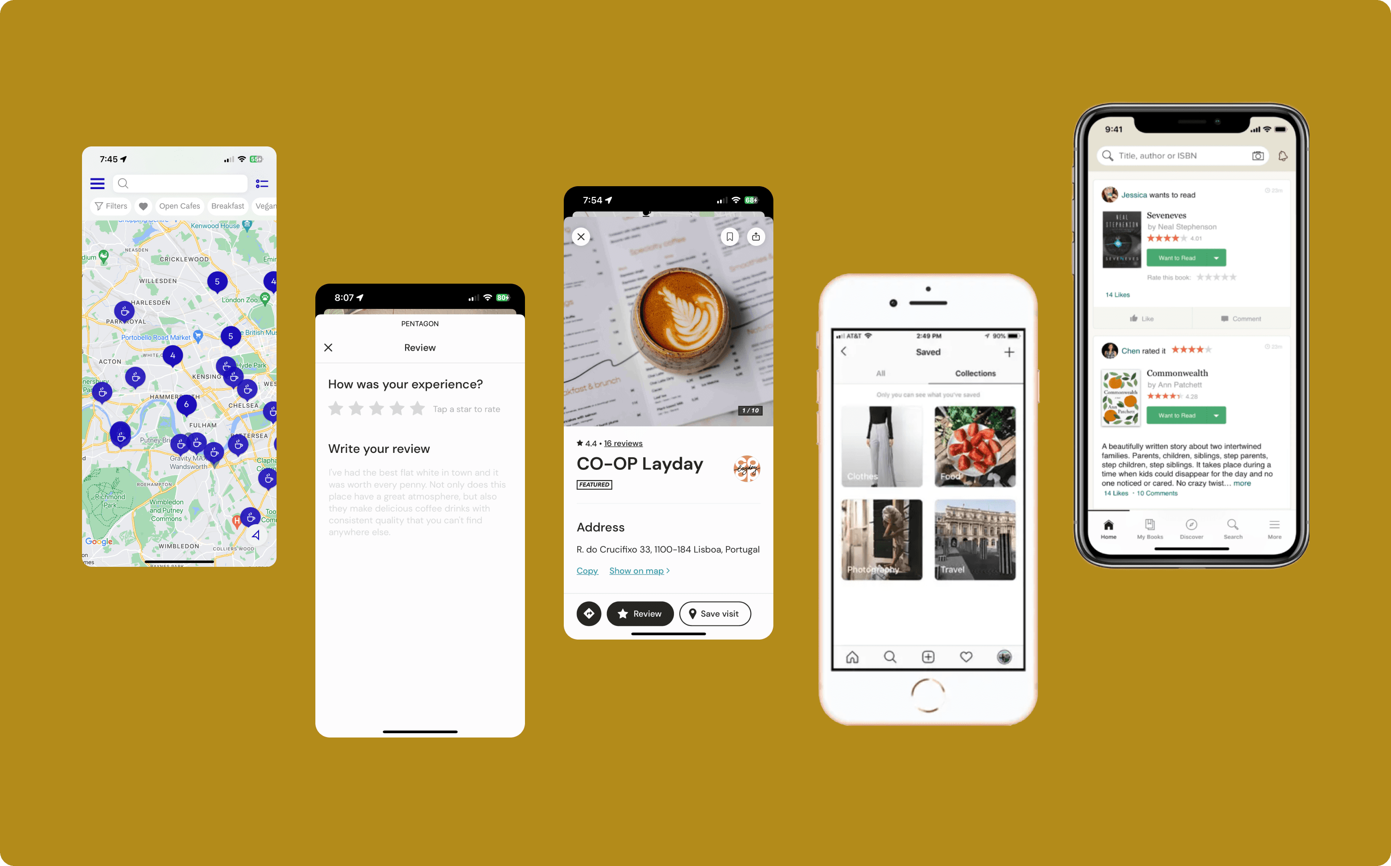
In order to understand how existing similar apps function and to be able to define a user flow, I conducted research into the following apps:
Coffee Trip - specialty coffee discovery app
Roasters - specialty coffee discovery app
Instagram - social media content creation & consumption
Goodreads - social media / community
Research Findings
Home screens are composed of a large map
Included search bar and a filter option, for personalized search
Shop page contains all necessary information, including photos, reviews, address, and contact info
Simple and straightforward review process to encourage user participation
Social media apps like Goodreads and Instagram offer a content flow where items are sourced to a single location
Neither app offers a dedicated social feed where users can interact with each other
Upon conclusion of the research, I identified opportunities that allowed me to begin ideating and create a user flow suitable for the app’s concept. I adopted the approach of including a comprehensive review section and centralized content flow, while also filling the community feed gap, to encourage engagement and interaction among coffee lovers.
Mapping the Journey: User Flow
Based on the competitive analysis, I pinpointed the key functionalities necessary to ensure a seamless and intuitive user experience. From these requirements, a user flow diagram was created to better understand how the user would navigate the application.

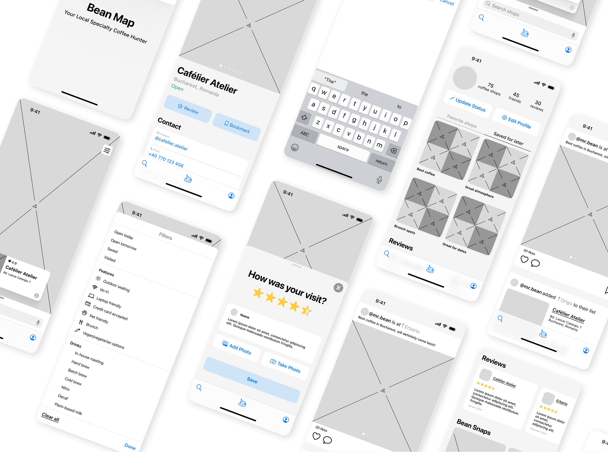
Shaping the Vision: Mid-Fidelity Wireframes
Mid-fidelity wireframes were drafted in conformity with Apple's Human Interface and Material Design Guidelines.
(iOS displayed below)
Refining the Experience: User Testing & Iterations
I created two prototypes of the iOS and Android versions, and recruited several users that were most familiar with these devices. The goal of the test was to generate feedback on these following questions:
Is the flow for finding coffee shops accessible & intuitive?
Do the patterns for the feed & discover align with current design trends?
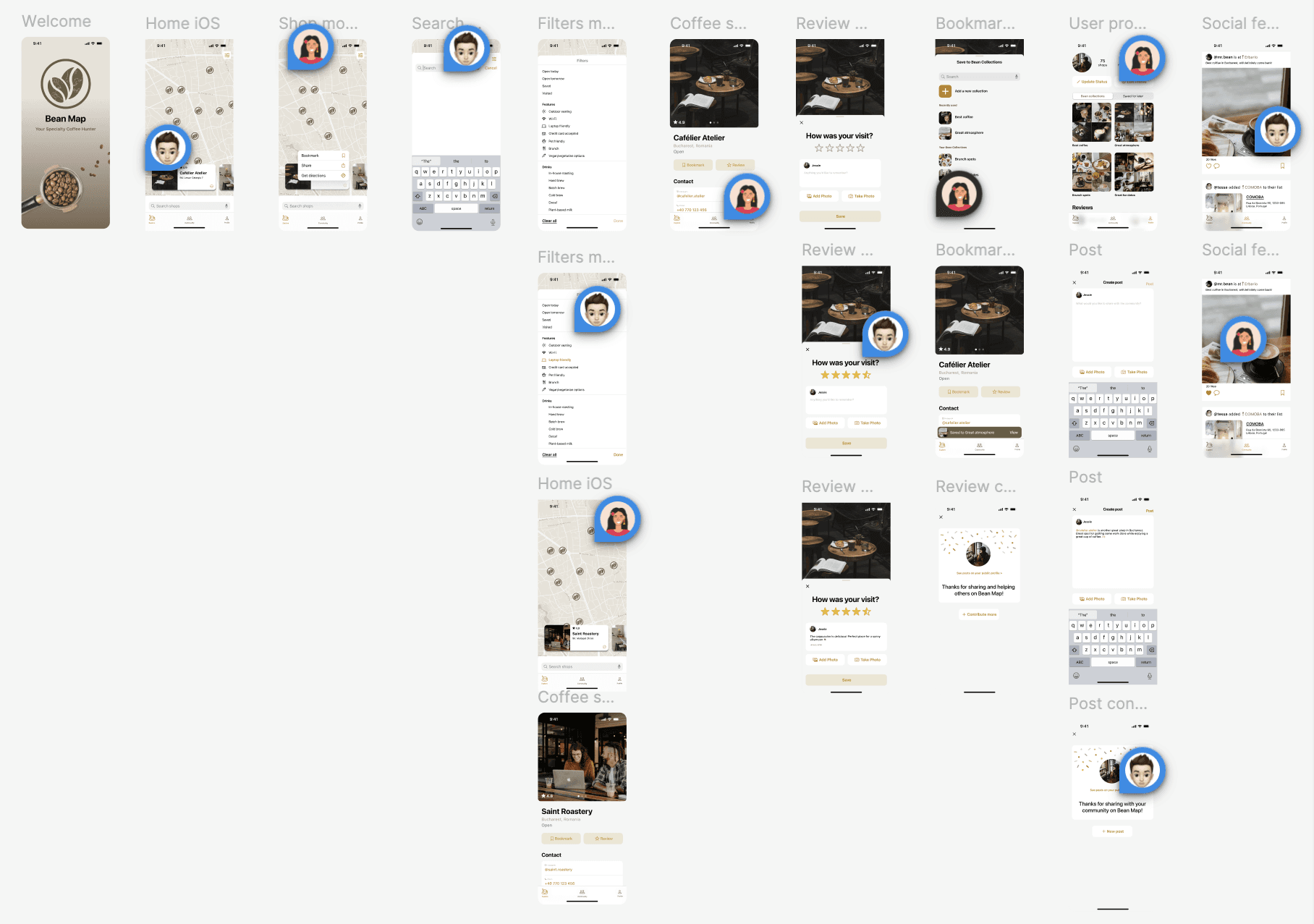
Mutual feedback for both versions concluded I needed to make some changes. See below.
Bringing Bean Map to Life: Design Mockups
After conducting research and user testing on the initial ideation phase, I was able to refine and design the 3 core aspects as outlined in the problem statement. I focused on the iOS guidelines below.
Search using a filter
Problems encountered
Users experienced difficulties clicking on the coffee beans due to their small size on the map.
The carousel items were not sufficiently elevated from the map, conflicting with material design guidelines.
Proposed solutions
Increased the size of the coffee beans on the map to make them easier to click.
Elevated the carousel items to align with material design guidelines and improve accessibility.
Bookmarking a café
Problems encountered
Users expressed that it would be more intuitive to be directed back to the cafe page rather than to the profile after bookmarking a cafe.
Proposed solutions
Directed the user back to the cafe page and included a toast banner that confirms the bookmark has been saved.
Reviewing a coffee shop
Proposed solutions
The success of submitting a review wasn’t clear to users, as there was no clear indicator.
Problems encountered
Created additional screens, including a success screen, so that users know their review was submitted and appreciated.
Engaging with a friend's post
Problems encountered
The proximity of the status to the username and photo made it unclear whether it was a status or a caption, causing confusion.
Proposed solutions
Added more spacing and a line to delimit the sections, making them clearer and easier to distinguish.
Making a new post
Problems encountered
The initial button for collections was labeled as “favorite shops,” which was misleading based on the UI design.
Proposed solutions
Updated the button label 'Bean collections' to more accurately reflect its function and also tie it to the app's branding.
Conclusion & Final Thoughts
It took several iterations to refine the functionality and user experience of Bean Map. Adhering to interface guidelines, especially for Android, required revisiting mid-fidelity wireframes to ensure alignment with platform-specific standards. Despite challenges, the project successfully achieved its objectives, offering a functional and intuitive coffee shop discovery app.
User responses from testing highlighted positive reactions, with users appreciating the simple and clean design, alongside intuitive navigation. This validates the effort invested in understanding and implementing effective UI/UX principles for both iOS and Android platforms.
Future iterations
Future iterations could expand functionality to include features like social connectivity among users, menu integration, and pre-ordering capabilities.
Measuring Success
An idea for a premium model could be to offer additional features or benefits for users who opt into a subscription or premium membership. Here are some ideas to monetize the app:
For Users:
Ad-free experience ensuring uninterrupted use of Bean Map
Exclusive loyalty rewards and special discounts at partner coffee shops
For Shop Owners:
Promotional opportunities to enhance visibility within the app, featuring high in search results and showcasing events or promotions
Access to analytics and insights to understand visit patterns and customer preferences for targeted marketing strategies
