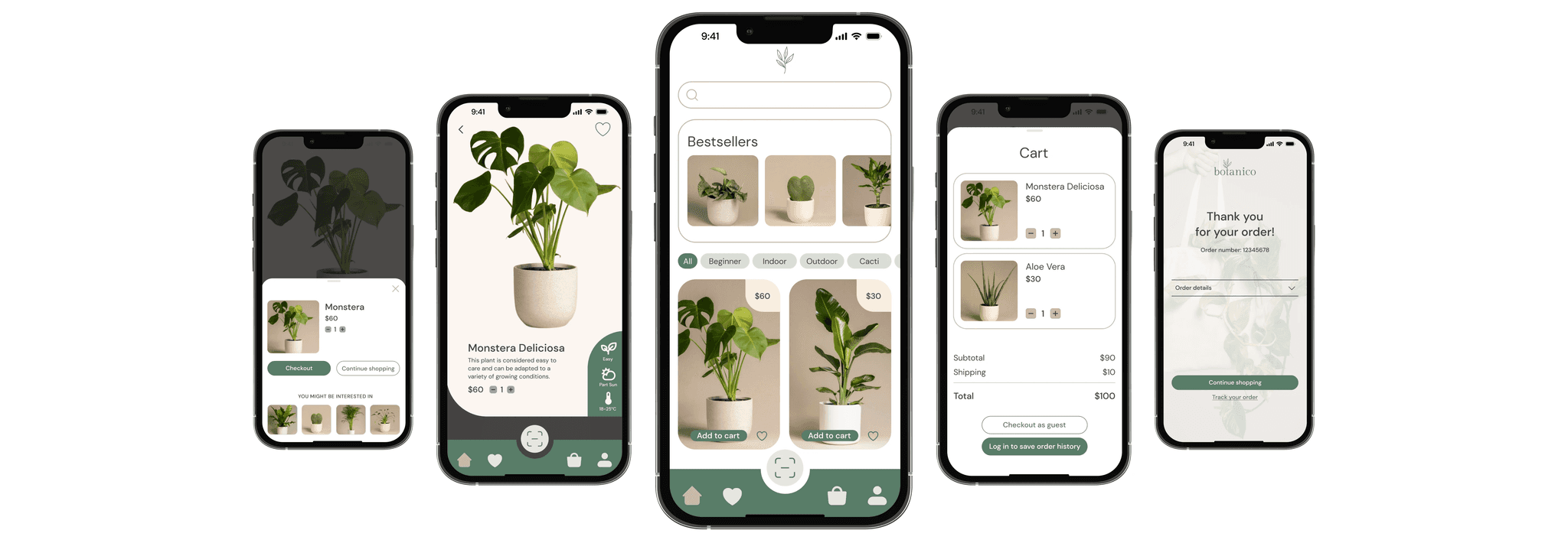
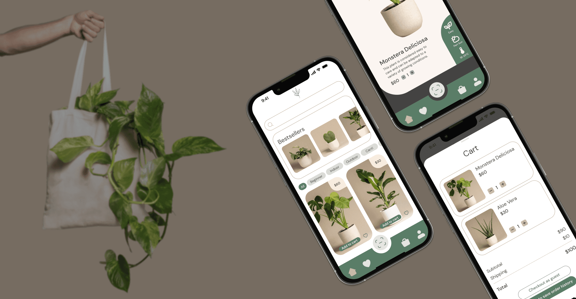
UI/UX Case Study - e-commerce app
botanico
Project Overview
botanico helps users cultivate their urban oasis effortlessly, at home, with just a few clicks. The app combines a user-friendly design with powerful features to make plant shopping a breeze for enthusiasts.
Problem Statement
Users are tired of the complex and unintuitive navigation systems in traditional online stores, leading to frustration and dissatisfaction. There is a need for a user-friendly platform that offers a seamless and enjoyable shopping experience specifically tailored for plant enthusiasts.
Proposed Solution
botanico provides a breath of fresh air with its sleek and dynamic experience. Its modern, clean design and smart filtering options are major drivers of botanico's success. The app aims to simplify the plant shopping process with easy navigation, trustworthy interactions, and a friendly environment where users can explore and discover plants with ease.
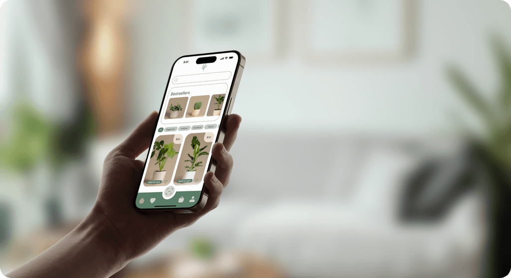
Design and Development
The design process was guided by user needs and industry best practices to create an intuitive and engaging experience for botanico.
Laying the Groundwork: User Stories
To ensure Botanico meets the needs of its users, I developed several user stories to guide the design and functionality of the app:
As a new user, I want to browse plants without logging in or signing up, so I can explore the available options before committing.
As a seasoned plant buyer, I want to see bestsellers at the top, so I know which plants are popular.
As a user adding plants to my cart, I want to easily adjust the product quantity, so I can manage my purchase better.
As a shopper, I want to resume shopping without being immediately taken to checkout, so I can continue exploring other plants.
As a buyer at checkout, I want to see different payment options, so I can choose the one that suits me best.
Mapping the Journey: User Flow
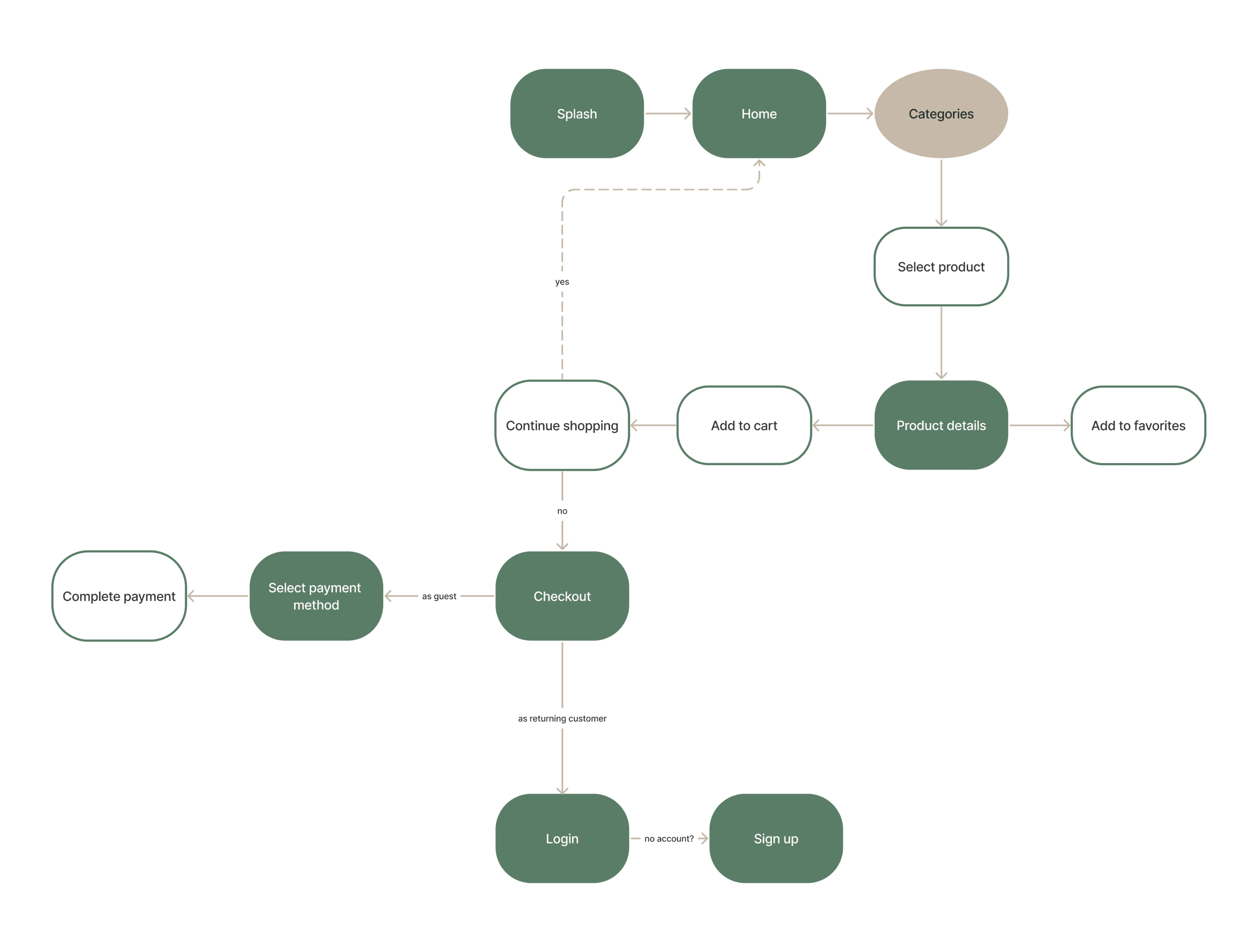
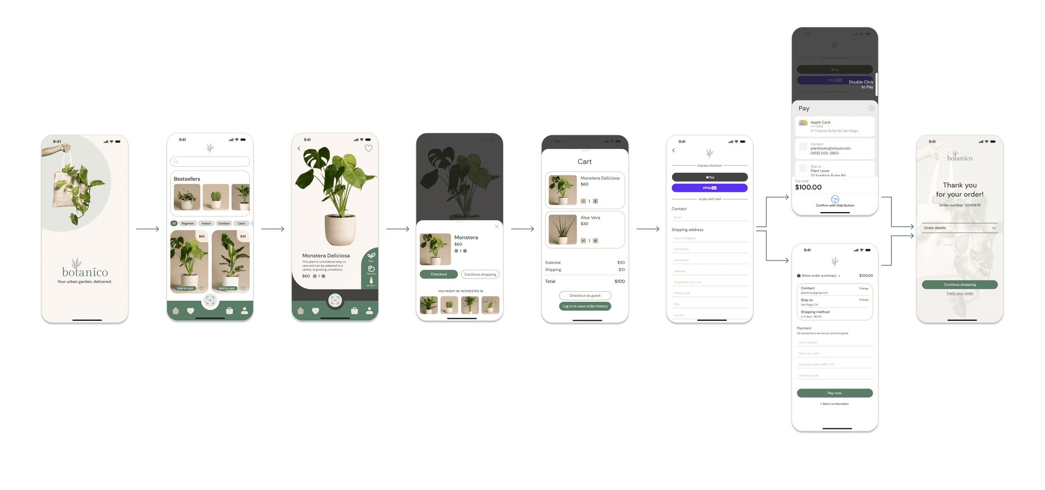
A detailed user flow diagram was created to map out the user journey from browsing plants to completing a purchase. This ensured that the process was intuitive and streamlined.
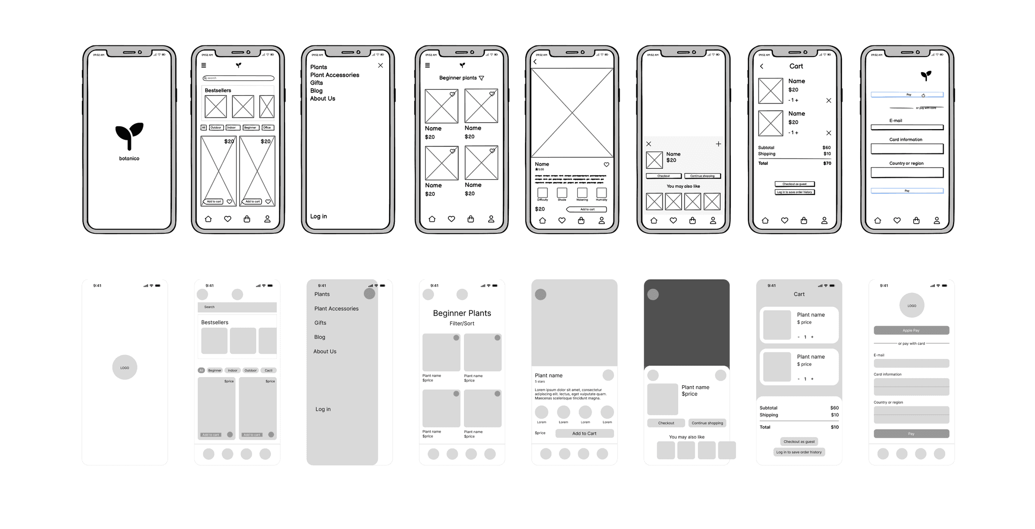
From Sketches to Screens: Wireframes
Wireframes were developed in two stages:
Low-Fidelity Wireframes: Initial sketches to outline the basic structure and layout of the app.
Mid-Fidelity Wireframes: More detailed designs with placeholder content and initial navigation elements.
Testing the Waters: User Testing and Feedback
User testing was conducted to gather feedback on the initial designs. Positive feedback included:
Clear user flow and fast, easy checkout process.
No login or sign-up required to browse plants.
Bestsellers displayed at the top.
Easy adjustment of product quantity.
Ability to resume shopping without being taken to checkout immediately.
Various checkout options available.
Constructive feedback highlighted areas for improvement:
Add more filters and make the filter options more visible.
Improve the beginner filter to refresh the view rather than opening a new page.
Ensure consistent navigation with typical app design patterns.
Display confirmation of successful transactions after payment.
Iterating for Perfection: Implemented Changes Based on User Feedback
Added additional filters and made them more visually accessible.
Updated the beginner filter to refresh the view instead of opening a new page.
Adjusted navigation to be more consistent with typical app patterns.
Implemented a confirmation screen for successful transactions.
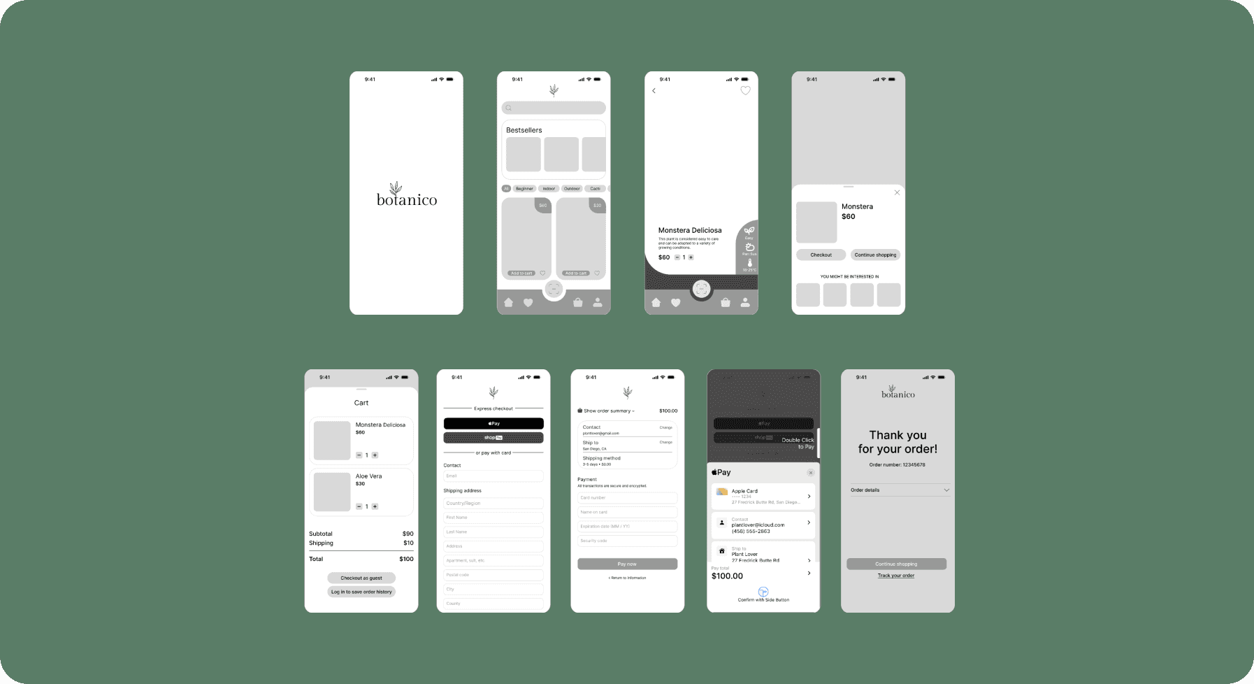
Crafting the Interface: UI Design
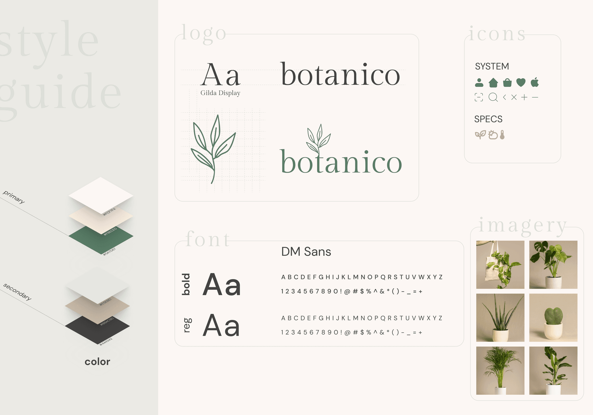
The UI design adhered to Botanico’s brand guidelines: simple, trustworthy, and friendly. A clean and minimalist design with intuitive navigation was prioritized to enhance the user experience.
The Logo
The logo combines modern simplicity with a touch of nature. Clean lines and balanced spacing in the typography exude contemporary charm, while a subtle herb playfully hints at the app's botanical focus. This minimalist design communicates sophistication effectively.
Imagery
Images will feature a professional look with clean, neutral backgrounds and studio lighting. Consistency in style will create a cohesive aesthetic, inspiring trust and professionalism.
Scaling Up: Desktop Design
A desktop version of the app was also designed to ensure accessibility across different devices. The design retains the simplicity and user-friendly nature of the mobile app, with adjustments for larger screen real estate.
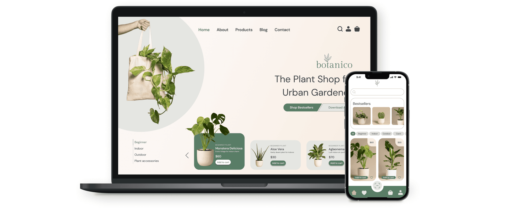
Bringing It All Together With Mockups
High-fidelity mockups were created to visualize the final design. These mockups included detailed UI elements, interactions, and transitions to provide a realistic representation of the app.
Conclusion & Final Thoughts
botanico successfully addresses the common pain points of online plant shopping with its user-friendly design and smart features. The iterative design process, guided by user feedback, ensured that the final product was both functional and enjoyable to use.
Measuring Success
Success for Botanico can be measured through several metrics:
User Engagement: Tracking the number of active users and time spent on the app.
Sales Metrics: Monitoring the number of transactions and average order value.
User Feedback: Collecting and analyzing user reviews and ratings to continuously improve the app.
Growth Metrics: Evaluating the growth in the user base and market reach over time.
By focusing on these key performance indicators, Botanico can ensure it continues to meet user needs and evolve in the competitive marketplace.
