UI/UX Case Study - responsive web app
CycleChef

Project Overview
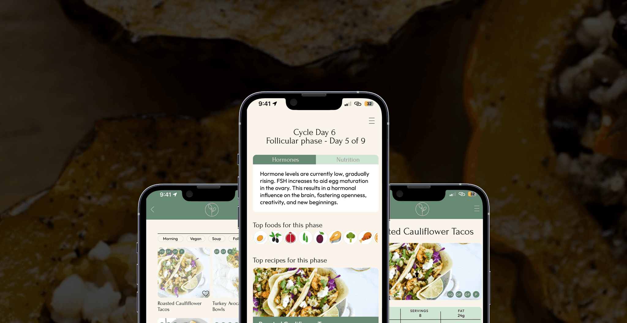
CycleChef is an app designed to assist women in finding hormone-balancing foods and meals that are beneficial for each phase of their menstrual cycle. By providing tailored dietary recommendations, the app aims to help women decrease symptoms associated with hormonal imbalances and achieve overall balanced health and a balanced menstrual cycle.
Problem Statement
A lot of women struggle with conditions like PCOS, endometriosis, infertility, and more due to hormonal imbalances. These conditions can significantly impact their quality of life, causing various symptoms and health issues. There is a need for a solution that helps women manage their hormonal health through dietary choices, thereby alleviating symptoms and promoting a balanced cycle.
Proposed Solution
To create a comprehensive resource for women looking to harmonize their menstrual cycles through dietary choices. This will be achieved by:
Providing a source of information and inspiration for women aiming to align their diets with their menstrual cycles
Offering strictly selected recipes that are cycle-optimized, wholesome, and easy to prepare, in line with the mission
Integrating educational content about hormone-balancing foods that are beneficial for each phase of the menstrual cycle, empowering women to make informed dietary choices

Insightful Ingredients: User Research
Hypothesis
Current dietary trends among women aged 20-40 are evolving, emphasizing cyclical eating and aligning lifestyle with menstrual cycles. My initial hypothesis for the CycleChef's users includes:
Prioritizing nutrient-rich foods tailored to each menstrual phase for optimal well-being
Actively researching recipes and learning about phase-specific foods before cooking or meal planning
Proactively gathering ingredients at home or in stores to support balanced menstrual health
Utilizing the app's cycle-tracking calendar
Engaging with articles on menstrual health and dietary choices provided within the app

User Interviews & Synthesis
I conducted interviews with potential users with targeted questions to provide qualitative information about their preferences, and found out some interesting results that were outside of my initial hypothesis.
I gathered the answers and found common pain points across all the interviewees, along with some new insights:
Users appreciate recipes that include photos of the finished meal
They prefer streamlined access to recipes without excessive scrolling or additional content
There's significant interest in nutritional information provided alongside recipes
Users prefer recipes that display cooking time and ingredients prominently
There's a strong desire for features that allow inputting symptoms to receive tailored food remedies
Findings showed a preference for quickly accessing recipes with clear, distraction-free, full-screen instructions, and the ability to input symptoms for personalized food remedies.

Framing the Vision
User Personas
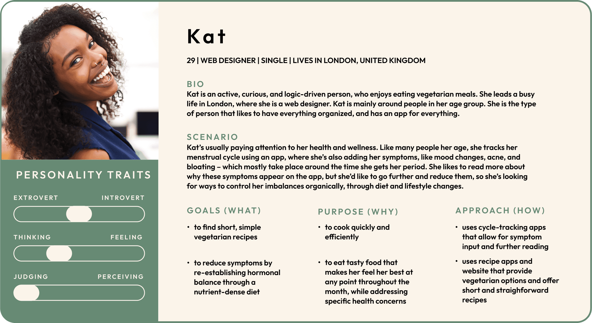
I created several personas, here I am highlighting one. This persona paired with the previous research gave me insights on how to proceed with defining an MVP objective.

The MVP Objective
Develop a streamlined experience emphasizing ease of use and the connection between nutritional science and wholesome recipes, integrating the opportunity to learn about hormone-balancing foods beneficial for each phase of the menstrual cycle.
From Concept to Reality
User Flow
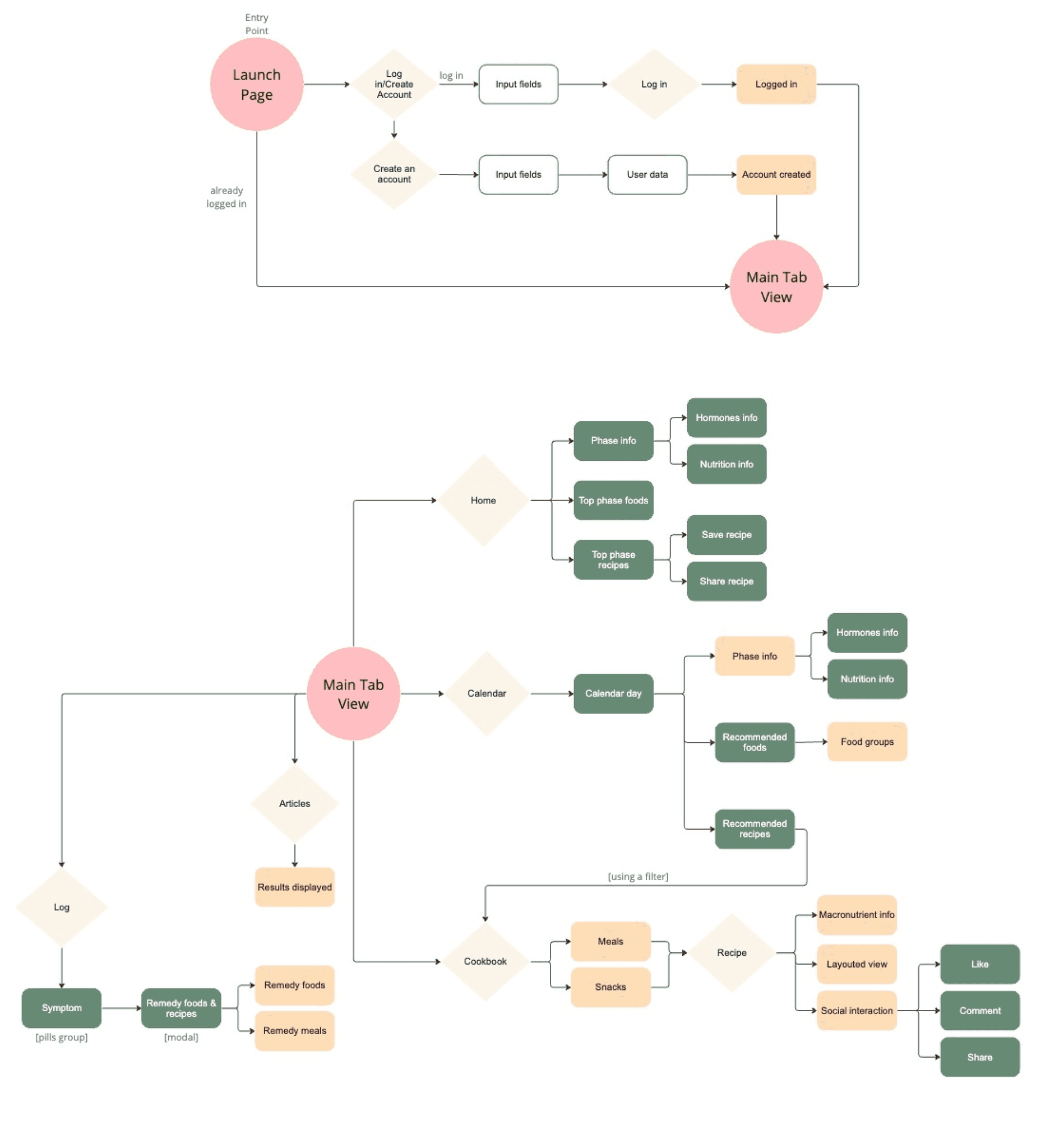
I created a user flow which informed the ideation for the screens:

Rapid prototyping & user testing
I decided to get users involved early on - and prepared a prototype from the sketches. This was tested on the same user group I also interviewed, to generate insights in order to reiterate the design sooner rather than later.

The goal of this test was to assess user learnability with the CycleChef app. I observed whether users could complete the following objectives:
Evaluate ease of user login and sign-up.
Determine user proficiency in discovering recipes for their current menstrual phase.
Gauge the system's intuitiveness in providing information about cycle-optimized foods and recipes.
Assess the intuitiveness of the calendar function.
Collect feedback on the overall usability of the system.
Crafting the Ideal Solution
Redefining the problem statement
Compiling results from the UX research and prototype test, I realized I had to redefine the solution to my initial problem statement. Post-interview analysis revealed that users didn't care much about the recipe's story; they wanted to get straight to the recipe and enthusiastically start cooking.
Main problems encountered
Distractions on recipe page cause loss of interest
Confusion about page’s name 'Log'
Difficulty in recognizing that additional recipes exist beyond those displayed on the Home page
Proposed solutions
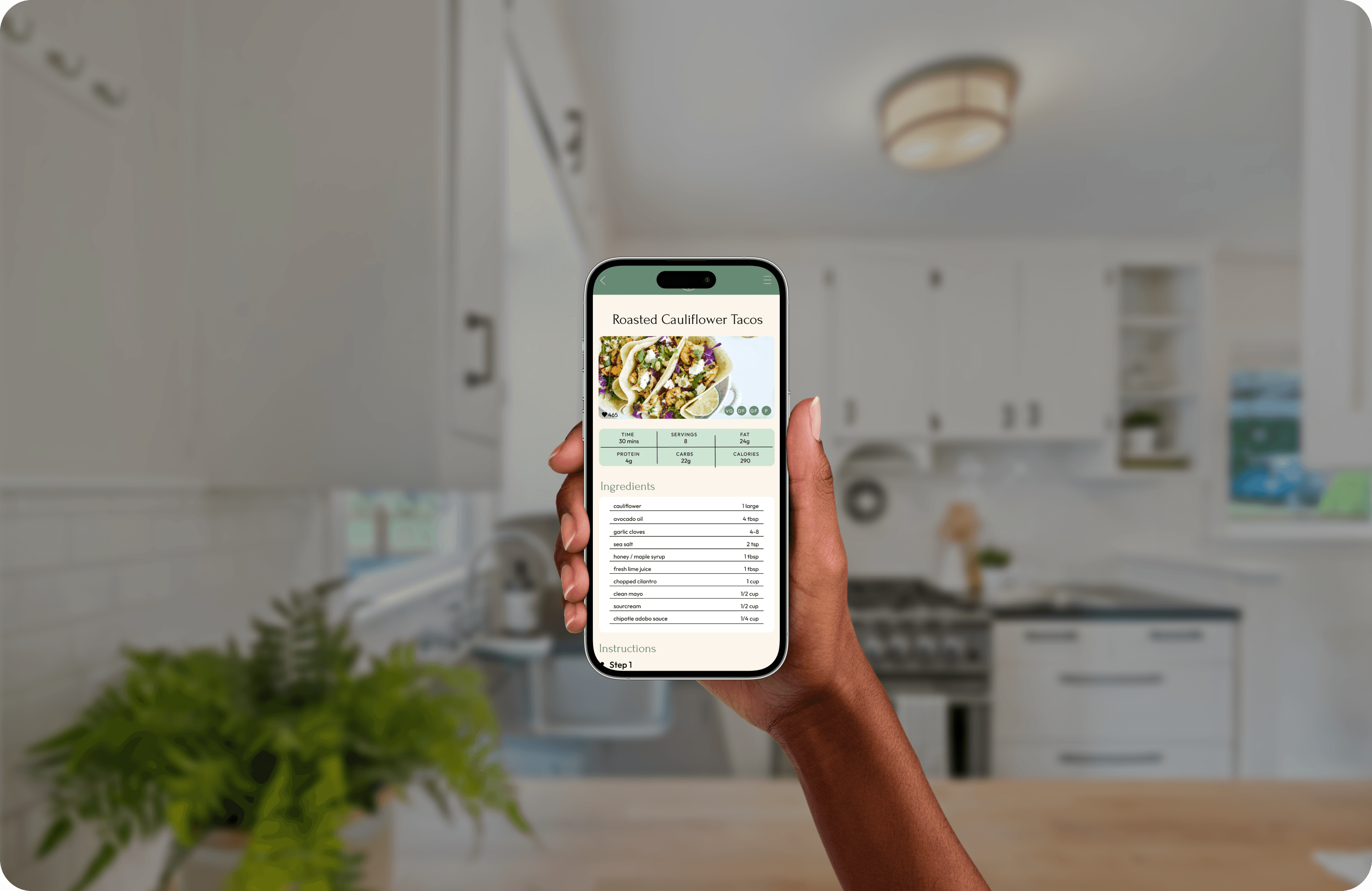
The recipe page provides focus on a hero image and clear recipe instructions
Changed the page's name 'Log' to 'Symptoms'
Added “see more” button on Home page
Branding & Style Guide

Responsive Design: Tablet & Desktop Breakpoints
Even though the consensus on mobile was that users didn't want any extra distractions on the recipe page, there were a few people that mentioned some extra photos of the recipe steps would be useful, so I've included them in the pad and desktop versions.

Conclusion & Final Thoughts
The testing and UX research provided invaluable insights that guided the evolution of the app. User feedback highlighted the importance of direct access to recipes and minimizing distractions. Users prioritized immediate access to recipes over supplementary content like recipe stories, leading to a streamlined design with a prominent hero image and clear, concise instructions.
This iterative process underscored the importance of user-centered design. By listening to feedback and continuously refining the app, I created a more intuitive and satisfying user experience. These insights will inform future updates, ensuring CycleChef remains aligned with user needs and expectations.
Ideas & Future Iterations
Implement machine learning to recommend recipes based on user preferences and past behavior
Provide personalized meal plans tailored to individual cycles and nutritional needs
Create an in-app forum for users to share experiences, recipes, and tips
Regularly update the database with diverse, culturally inclusive recipes
Enable users to submit recipes and rate others
Develop more advanced search and filter options for dietary restrictions, ingredients, and cooking time
