UI/UX Case Study - animated app
Zenly
Project Overview
Zenly is an animated meditation app dedicated to helping young adults manage stress through smart, accessible solutions.
Problem Statement
In today's fast-paced world, young adults face significant stress from various sources, including work, social life, and digital overload. Traditional meditation methods are often not tailored to their tech-savvy and on-the-go lifestyle, creating a gap in effective stress relief solutions for this demographic.
Proposed Solution
Zenly aims to bridge this gap by providing a modern, user-friendly meditation app specifically designed for young adults. The app incorporates smart technology and intuitive design to offer quick and effective stress relief through guided meditations, mindfulness exercises, and calming animations. The inclusion of motion design from the concept phase ensures a seamless and immersive user experience that aligns with Zenly's core values of serenity, calmness, and minimalism.

Finding Zen: Mapping the market
To position Zenly effectively among other meditation apps, it was crucial to thoroughly analyze market leaders and trends.
Competitive Analysis
To ensure Zenly stands out in the crowded meditation app market, I conducted a thorough competitive analysis, analyzing popular meditation apps like Meditopia and Calm to understand their strengths and weaknesses, user interface designs, and overall user experiences. Key areas of focus included the variety of meditation options, ease of use, visual aesthetics, and user engagement strategies.

Research Findings
The competitive analysis revealed several insights:
Calm’s interface features a minimalist design with muted tones, creating a soothing atmosphere.
Calm offers smooth transitions and tranquil animations
Meditopia prioritizes accessibility with a sleek, minimalist interface and intuitive navigation.
Meditopia’s sessions are accompanied by tranquil visuals and soothing voices, providing a serene backdrop for mindfulness practice.
These findings guided the design and functionality of Zenly, making the following a priority:
Incorporating a captivating animation from the moment the app opens to set a peaceful tone and encouraging relaxation
Design’s emphasis on serenity and minimalism, using a subdued color palette and friendly illustrations to create a calming ambiance
Ensuring seamless transitions and incorporates gentle animations
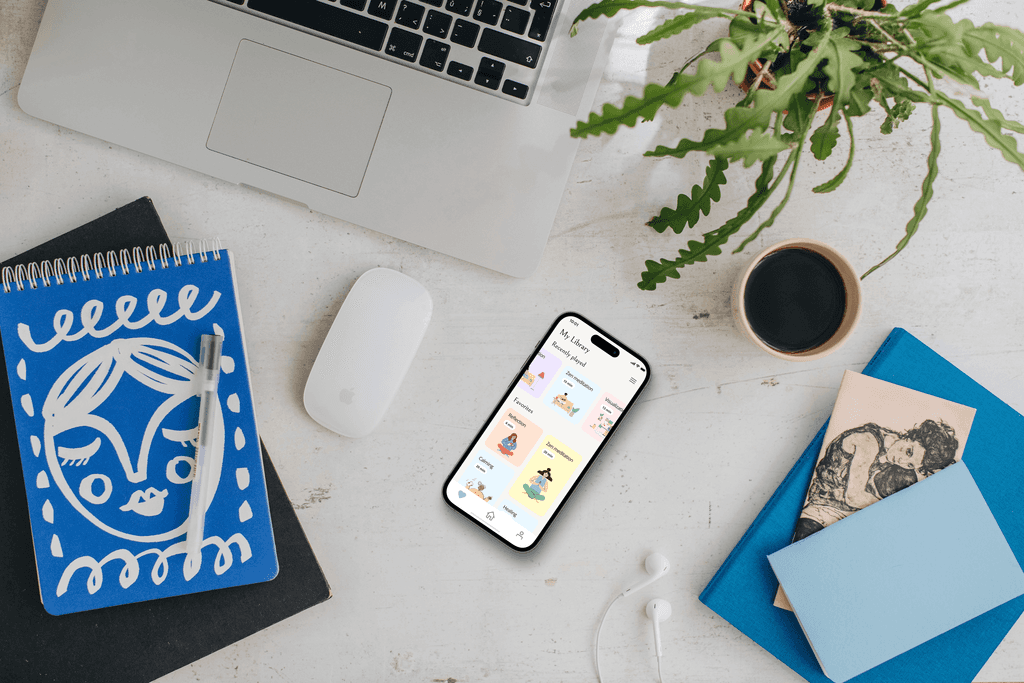
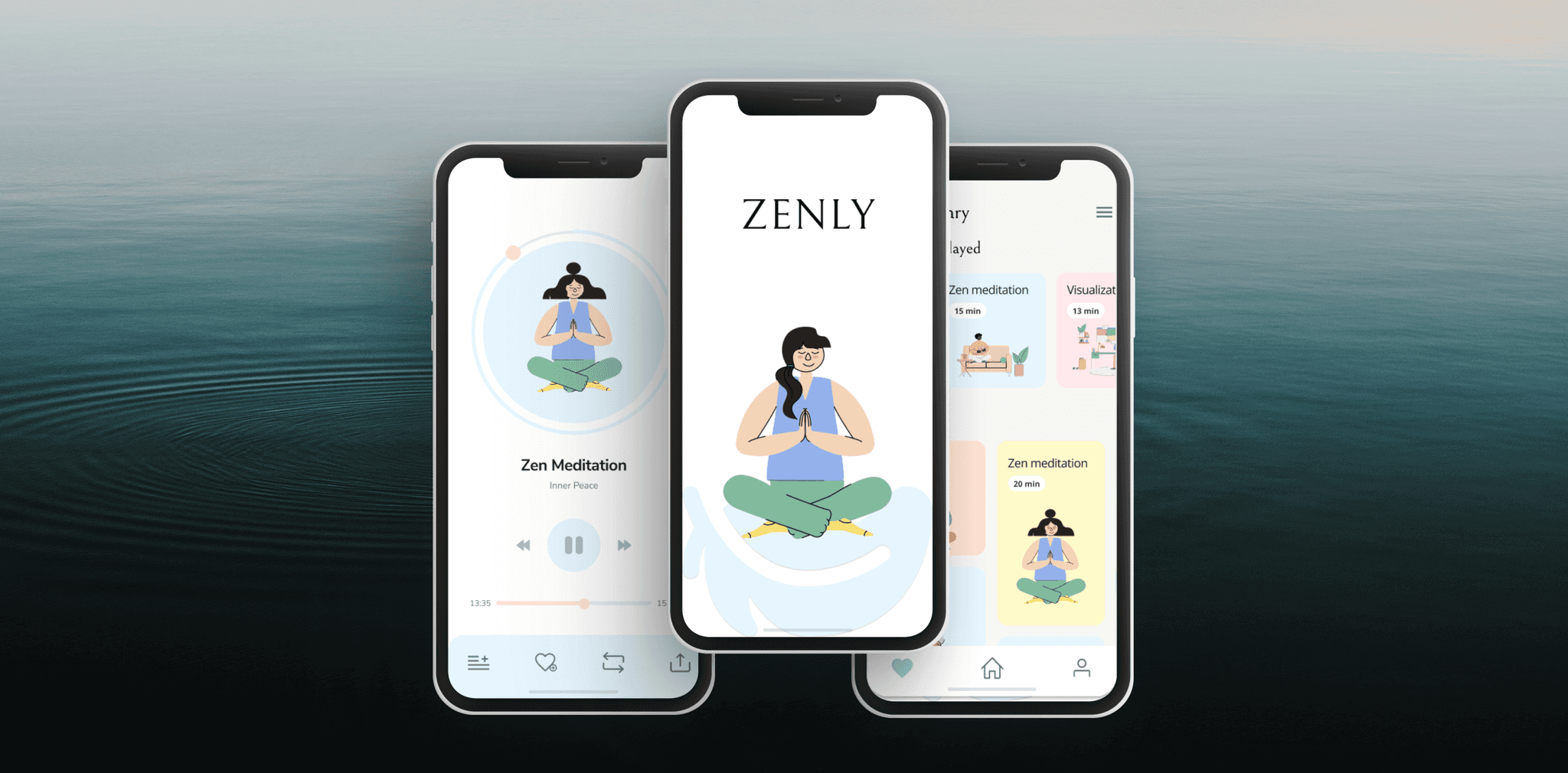
My Library page - featured meditations, cards
Guided meditation page - progress bar
Core areas to design
Home page - Serene ambiance
My Library page - featured meditations, cards
Guided meditation page - progress bar
Visualizing Tranquility: Storyboarding
The animations chosen reflect Zenly's principles across every screen and micro-interaction:
Don't get in the way: Each animation, such as the pre-loader screen featuring a falling feather, communicates Zenly's commitment to peace and user benefit without overwhelming them.
Make it feel natural: Screen transitions are designed to feel intuitive and smooth, employing easing to enhance fluidity and maintain a peaceful vibe.
Keep continuity: Consistency in transitions and interactions with the navigation bar ensures a cohesive user journey throughout the app.
Anticipation: Users anticipate the eventual settling of the feather, enhancing visual hierarchy through staging techniques. Zoom effects on the Favorite screen gradually focus on selected elements, enhancing engagement.
Micro-transactions: Interactive elements like menu buttons lighting up and dynamic dial movements in the Meditation screen enhance user engagement and feedback.
Taming the Beast: Mastering Adobe After Effects
Animating a meditation app intended for stress relief was ironically stressful, especially when learning to navigate Adobe After Effects, a complex and powerful tool. The challenge was to efficiently use the software to bring the intended animations to life without compromising the calming nature of the app.
With the guidance of my mentor and the app itself serving as a reminder to take breaks, the animation process became more manageable, and the project progressed smoothly.
Conclusion & Final Thoughts
Working on Zenly has been a rewarding experience, blending my passion for mental health with my skills in design and animation. The project reinforced the importance of integrating motion design from the beginning to create a cohesive and immersive user experience.
By focusing on the core values of serenity, calmness, and minimalism, Zenly not only addresses the stress relief needs of young adults but also sets a new standard in the meditation app market.
Measuring Success
The success of Zenly can be measured through various metrics:
User Engagement: Tracking the frequency and duration of app usage
User Feedback: Collecting reviews and ratings from users to gauge satisfaction
Retention Rates: Measuring how many users continue to use the app over time
Market Position: Analyzing the app's performance relative to competitors in terms of downloads and user growth
By continuously monitoring these metrics, Zenly can ensure it remains a leading solution for stress relief among young adults.

